Boron: A Friendly Display Font for Digital Branding
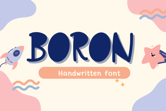
As a UI designer who ships dozens of landing pages, SaaS dashboards, and e-commerce sites each year, I pay close attention to how typefaces shape perception before a single word is read. Boron stands out—not because it’s loud or aggressive, but because it’s genuinely warm, approachable, and rhythmically distinct. It’s a display font with personality: slightly rounded terminals, gentle irregularities in stroke weight, and a subtle bounce in its letterforms that reads as human—not algorithmic. That matters when you’re designing for trust, clarity, or emotional resonance.
In practice, Boron thrives where voice and visual hierarchy intersect. Use it for hero section headlines on coaching websites or creative agency portfolios—its friendliness lowers barriers without sacrificing polish. On a course sales page, pair Boron with a clean, neutral sans serif like Inter or Manrope for body text, and suddenly your value proposition feels both expert and empathetic. The contrast works: Boron carries the tone; the sans serif handles the information.
It’s not built for long paragraphs or dense UI labels—but that’s by design. Boron excels in short, high-impact contexts: CTA buttons (“Start Your Journey”), section dividers (“What Clients Say”), banner text over lifestyle photography, or branded mug mockups in an online store. Its quirkiness lands best at 32px and up on desktop, and scales gracefully down to 24px on mobile—provided line height stays generous (1.4–1.6) and background contrast is strong. On dark backgrounds, test Boron at 10–15% lighter than default to preserve legibility; over image overlays, use a subtle semi-transparent backdrop or subtle text shadow for separation.
Readability isn’t just about size—it’s about rhythm and recognition. Boron’s open counters and consistent x-height support quick scanning, especially in hero sections where users decide in under three seconds whether to stay or scroll. Unlike overly decorative script fonts, Boron avoids ambiguity in characters like “a”, “g”, or “s”—critical for conversion-focused layouts where misreading costs momentum. And because it’s designed for digital use, its hinting and spacing hold up across Chrome, Safari, and Edge—even on mid-tier Android devices.
For brand consistency, Boron anchors tone without demanding uniformity. A boutique skincare brand might use it only for blog post headers and product launch banners—keeping navigation and pricing tables in a crisp sans serif. A children’s learning app could deploy Boron in tutorial cards and achievement badges, reinforcing playfulness while keeping instructions in a highly legible system font. The key is intentionality: Boron signals warmth, curiosity, and care—so use it where those values need emphasis, not decoration.
Font pairing is where Boron shines most strategically. As a display font, it pairs naturally with humanist sans serifs (like Lato or Poppins) for modern, accessible interfaces—or with low-contrast serifs (such as Crimson Pro or EB Garamond) for editorial depth in blog headers or newsletter subject lines. Avoid pairing it with other display or script fonts; the contrast between Boron’s friendly irregularity and a grounded, functional companion creates balance, not noise. If your project requires multilingual support, verify that the Boron package includes extended Latin glyphs—most versions cover Western and Central European languages, but Cyrillic or Greek may require confirmation with the foundry.
Practically speaking, Boron comes in standard webfont formats (WOFF2, WOFF) and typically includes one weight with optional stylistic alternates—ideal for subtle variation in headings versus accent text. No variable axis, but its single-weight clarity suits focused digital applications well. When embedding, serve it via a self-hosted CDN or licensed font service to ensure fast load times and full control over fallback behavior. Never rely solely on Google Fonts for display fonts like this—their rendering can vary, and licensing terms may not cover commercial templates or client-facing SaaS products.
Licensing is non-negotiable. Boron is a commercial font, and its license must explicitly cover web use—including embedded fonts in online stores, hosted landing pages, digital templates sold on marketplaces, and white-labeled dashboard UIs. If you’re building for a client, confirm their license covers redistribution or resale. For internal tools or prototypes, many foundries offer trial files—but never ship live code using unlicensed assets. It’s not just legal hygiene; it supports the designers and foundries who craft thoughtful design assets we rely on daily.
I’ve used Boron on a nutrition coach’s booking page where the headline “You Deserve Better Energy” needed warmth without cliché—and it delivered. On a ceramicist’s online shop, it anchored product launch banners and “Handmade With Care” tags on packaging mockups, reinforcing authenticity. Even in a minimalist portfolio site, Boron appeared only in the “About” section header and project titles—enough to signal personality, never enough to distract from the work itself.
That restraint is Boron’s strength. It doesn’t shout. It invites. In a landscape saturated with ultra-thin, geometric, or aggressively tech-forward type, Boron offers something rarer: digital typography that feels like a conversation—not a command. It supports brand identity not by dominating space, but by clarifying intent. Whether you’re refining a checkout flow, crafting a brand kit for a creative entrepreneur, or designing social media graphics for a podcast, Boron gives you a reliable tool for expressing humanity in interface design—without sacrificing professionalism or performance.
For web designers, UI specialists, and digital product creators who treat typography as infrastructure—not ornament—Boron is more than a typeface. It’s a tone-setting asset that earns attention, builds rapport, and holds its ground in responsive, conversion-driven layouts. Used deliberately, it becomes part of your design language—not just a stylistic choice.